
16 coaches online • Server time: 03:47
* * * Did you know? The best interceptor is Leena with 22 interceptions.
| Recent Forum Topics |


2015-04-03 16:53:50
43 votes, rating 5.1
43 votes, rating 5.1
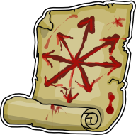
Chaos pact race logo
So in case you didn't see the forum post, I'm going to brag about my creation in a blog!
I made a logo. It makes me sad to see the big question marks on the current games list. I started with Chaos Pact, and underworld is next (depending how well this one goes!)
Rate my artwork, not this blog ;)
I made a logo. It makes me sad to see the big question marks on the current games list. I started with Chaos Pact, and underworld is next (depending how well this one goes!)
Rate my artwork, not this blog ;)
Comments
Posted by MattDakka on 2015-04-03 16:59:19
What about a green and red Chaos star, as suggested by Garion?
Don't like the scroll icon, although I understand the idea of the pact written with blood.
Don't like the scroll icon, although I understand the idea of the pact written with blood.
Posted by jimimothybodles on 2015-04-03 17:11:44
Yeah i didn't really get the Pact-y vibe from a green and red star. Or am i missing something? :)
Posted by Stimme on 2015-04-03 17:16:18
I like it and think it fits well style wise with other race logos.
Posted by albinv on 2015-04-03 17:19:34
Supercool you're looking into this! Gotta say im not crazy about the scroll symbol as well, though it makes sense ofc.
Maybe just 3 big guy fists in a "high five" posture? Yeah dunno. Simple but still better than the scroll i feel. I dont like this scroll altogether, frankly. ;)
6+ for the effort and attitude. 2 on the artwork itself. I still will vote high, as i want this blog to stay at top and get some recognition (assuming a high score will do that).
Posted by JimmyFantastic on 2015-04-03 17:23:34
I like it, good job!
Posted by CastleMan on 2015-04-03 17:23:45
semi cool artwork, SUPER COOL you are trying to get this done. Bravo sir.
Posted by jimimothybodles on 2015-04-03 17:28:26
Thanks people! What I'm hoping is that "semi-cool" beats "crappy question mark" and at least Fumbbl can have a complete set of logos :)
Posted by sonrises on 2015-04-03 18:38:53
6 for the idea, effort, attitude....
Ok, artwork...my very honest vote is...4
I like the concept but it looks quite different to the other logos though....Do you have a smaller version to see how this logo would work in Fumbbl main page?
Anyway, thanks for the effort! i am looking forward to your final version.
I take the chance to ask your permission to use the final version as a TOP 25 Badge.
o/
Posted by harvestmouse on 2015-04-03 18:52:40
"Yeah i didn't really get the Pact-y vibe from a green and red star. Or am i missing something? :)"
Green and Red are the team colours for the Chaos Allstars. Chaos Pact is a CRP version of the Allstars (who had a team list in 2nd Ed).
Green and Red are the team colours for the Chaos Allstars. Chaos Pact is a CRP version of the Allstars (who had a team list in 2nd Ed).
Posted by Jeguan on 2015-04-03 19:04:00
Awesome. Get that question mark replaced :)
Posted by jimimothybodles on 2015-04-03 19:21:17
Green and red eh?... on further googling, it seems the colour scheme is more "Teal and Salmon". Oooh, effeminate! :D I am a bit tempted to do at least a mock-up...
Posted by Cavetroll on 2015-04-03 19:22:06
Artwork is pretty good, and it beats a question mark. I'd rather see this now, and then if someone else comes up with something better later maybe Christer can swap it in.
Posted by Roland on 2015-04-03 19:33:20
I like it a lot!
Alert big C now and have those '?' Changed!
Alert big C now and have those '?' Changed!
Posted by Wizfall on 2015-04-03 22:01:49
At first i was not too fond of it but eventually i think it will be sweat with the right size.
And the concept is great.
So much better than the awful "?"
Other possibility the chaos pact logo you can find here :
https://lataniereducrocodile.wordpress.com/2012/11/11/logos-des-equipes-de-bloodbowl/
(custom made and no official, the artist is a nice guy too)
And the concept is great.
So much better than the awful "?"
Other possibility the chaos pact logo you can find here :
https://lataniereducrocodile.wordpress.com/2012/11/11/logos-des-equipes-de-bloodbowl/
(custom made and no official, the artist is a nice guy too)
Posted by Rabe on 2015-04-03 22:29:31
I like it. But I like scrolls in general. :-) Thanks for the effort, rated 6!
Posted by PainState on 2015-04-03 22:53:23
It is a lot better than a black question mark.
Double thumbs up for doing this and I hope Christer approves it and gets that stupid question mark removed.
Double thumbs up for doing this and I hope Christer approves it and gets that stupid question mark removed.
Posted by Nightbird on 2015-04-04 06:47:24
Maybe surround the blood star w/ a green aura to represent the colors.
Otherwise it's a decent attempt at it. Good job man.
Otherwise it's a decent attempt at it. Good job man.
Posted by mike467 on 2015-04-04 08:11:23
Nice one mate, the question mark does indeed suck so kudos to you for doing this. Keep up the good work!
Posted by Balle2000 on 2015-04-04 08:15:21
I think it needs a couple of more work-feedback cycles. Still not on the same level as the other logos. But you've come a good way.
Posted by SAILA on 2015-04-04 09:18:46
How about a handshake as a symbol of a pact?
lot of inspiration here:
https://www.google.com/search?q=handshake+logo&source=lnms&tbm=isch&sa=X&ei=VY8fVbPuMc3KaJ_9gvgJ&ved=0CAcQ_AUoAQ&biw=1366&bih=647
just make the hands more "chaosy" by adding claws or something, chaos star instead of a globe etc.
lot of inspiration here:
https://www.google.com/search?q=handshake+logo&source=lnms&tbm=isch&sa=X&ei=VY8fVbPuMc3KaJ_9gvgJ&ved=0CAcQ_AUoAQ&biw=1366&bih=647
just make the hands more "chaosy" by adding claws or something, chaos star instead of a globe etc.
Posted by Bobs on 2015-04-04 11:31:37
Something like this maybe
http://img2.wikia.nocookie.net/__cb20110609201303/vampirewars/images/7/74/Blood_Pact_large.jpg
http://img2.wikia.nocookie.net/__cb20110609201303/vampirewars/images/7/74/Blood_Pact_large.jpg
Posted by jimimothybodles on 2015-04-04 11:45:18
Just to say... this isn't a suggestion box. And Mr Foulscumm made the first batch of logos 4 years ago... sorry this isn't as good as his. He's had plenty of time to finish them! ;) So the question is... My one, or the question mark!?
Posted by Balle2000 on 2015-04-04 14:51:17
Neither is this a poll for replacing or not replacing. The question, in my opinion, is rather will you put some more work into it to get it to the same level? :)
Posted by Badoek on 2015-04-04 16:15:44
Rated 4 which imho is good enough to replace the question mark.
+1 to Balle2000
+1 to Balle2000
Posted by jimimothybodles on 2015-04-04 16:52:02
I've reached my skill limit, being a complete noob of paintshop. Feel free to make your own "up to standard" logo for me to rate in return. Cheers all :)
Posted by fidius on 2015-04-05 01:31:28
I like it and would vote "yes" to replacing the ? with the scroll.
Hearkening back to the Chaos Allstars with a star logo is extremely pedantic and boring imo. The race was a mistake, lets all be honest -- so why reinforce the dumb rationale behind it?
Another idea would be 2 chaos-y hands/claws (ie one Khorne, one Slaaneshi say) in a vertical grasp, with blood dripping down both wrists/arms from between the two. A pact made in blood.
Posted by ImpactedAnimal on 2015-04-05 12:11:54
Voted 5 - replace the ? !