
23 coaches online • Server time: 05:04
* * * Did you know? The fouliest player is Bruce Wayne XVII with 2010 fouls.
| Recent Forum Topics |
2015-04-09 18:50:36
13 votes, rating 4.9
13 votes, rating 4.9
Team Logos! (I may be addicted...)
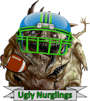
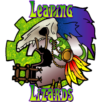
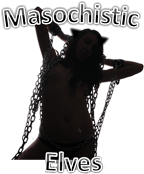
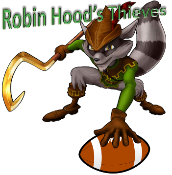
So, I appreciated the advice/feedback I had received from my recent forum and blog posts... I've learned a lot and now have become slightly obsessed with making team logos... I think they've turned out pretty well so far... Let's see what you all think! Note: Click on the image and it will link you to the corresponding team.
Some older ones that I had before:
Now that I've made logos for all these teams, I guess I should start using them more often! :)
Some older ones that I had before:
Now that I've made logos for all these teams, I guess I should start using them more often! :)
Comments
Posted by seanh1986 on 2015-04-09 18:51:46
The older ones are probably due for an upgrade... At the very least, I can use my new found skills to improve them (Sekhmet's Scourge should be bigger!)
Posted by albinv on 2015-04-09 19:01:50
Maso elves seriously lack some curves (is that an ironing board or a woman?)!
Nice tho.
Nice tho.
Posted by albinv on 2015-04-09 19:05:37
Nurgle is bestest.
Posted by akaRenton on 2015-04-09 19:06:34
More fluff is always a good thing :D
Posted by MRnobody on 2015-04-09 19:24:48
Slann one is best... Because they're slann
Posted by Roland on 2015-04-09 19:36:55
Isn't it fun :D
Posted by Jim_Fear on 2015-04-09 20:22:04
I'm going to be the jerk and say it:
Amphibians are not lizards.
Amphibians are not lizards.
Posted by Buliwyf on 2015-04-09 21:43:22
Rated 6 for the cool works! i love the Racoon's Robin Hood logo! \o/
Posted by jimimothybodles on 2015-04-09 21:49:45
Team names embedded on logo. Tautological folly, or necessary addition? Discuss.
Posted by Dunenzed on 2015-04-10 00:25:12
Albinv, since it's elves you might want to amend that to is it a man, woman, or ironing board.
Posted by paradocks on 2015-04-10 08:51:12
leaping lizards logo is awesome!
Posted by seanh1986 on 2015-04-10 14:43:54
Thanks guys :). The leapin' lizards logo was fun to make, I added in the lizard under the Slann bone helmet. I had to crop out everything other than the bone helmet and it consists of three layers: Bottom = Full helmet, Middle = Lizard leaping, Top = Slann bone helmet only (so it covers a realistic portion of the logo).
I used a similar scheme to make the Ugly Nurglings logo to make the football look like it was tucked under his arm. I also adjusted the brightness of the helmet and ball to make them look less bright, so they'd look more similar to the overall image brightness.
I used a similar scheme to make the Ugly Nurglings logo to make the football look like it was tucked under his arm. I also adjusted the brightness of the helmet and ball to make them look less bright, so they'd look more similar to the overall image brightness.
Posted by albinv on 2015-04-10 19:41:05
@Dunenzed
lol
good point.
lol
good point.

