21 coaches online • Server time: 09:18
* * * Did you know? The player with the strongest arm is Cherrystone Hotpack with 5758 yards passed.
| Recent Forum Topics |
2019-04-07 16:59:39
19 votes, rating 6
19 votes, rating 6
Scaling Icons
This blog is the 2nd part in a series covering the scalable client project. The first part covered the background and why we need it.
In this part, I want to push forward and talk about the problems of scaling icons and the benefits and drawbacks of various methods. I will also bring up the direction we are going right now and get into some possibilities I want to explore with this.
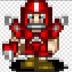
So let's begin at the current state and look at a typical icon, let's say a typical human lineman, scaled to 800%:

This blue-eyed youngling, eager to prove his worth on the pitch is a great icon, much like all the other ones we have on the site. However, there is a problem..
The current icon is the perfect size for a square of 30x30 pixels. When we introduce a scalable client (or more specifically a scalable field), the square size will go up, let's say to 35x35, which is roughly a 17% increase in size.
Look closer at the icon above, and you'll see that the head is 11 pixels wide. With a 17% increase, we need to somehow scale this to 13, adding 2 pixels in width for the head. And this is where we run into trouble. Where would you add those two pixels? Between the eyes? On the edges? What if we wanted to increase the scale a bit more and and had to make the helmet 16 pixels wide?
The core of the problem we're facing here is that the icons are inherently imperfect representations of a "reality", an artist has taken the concept of a human Blood Bowl player and the pixels in the icon represent the concept in a very limited amount of space. The eye of the player is two pixels wide, and conveys that they are blue. The overall context of where they are placed means we, as humans, interpret those two pixels as blue eyes. In order to scale the image up to an arbitrary size, we'd need to convert the pixel art into what it is originally supposed to represent, and then reduce that back to the size we want. This is a difficult process, especially considering that doing this miniature size icon means you have to super emphasize things like the eyes (which are way too big to be anatomically correct), much in the same way theatre makeup tends to super emphasize certain traits of the actors.
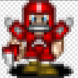
That being said, there are ways to rescale things using software. The simplest form is what's called "nearest neighbour" where you simply stretch the smaller icon into a larger canvas and pick the colour of the pixel that is closest. To visualize this a bit better, let's say we do the 17% increase of the human (and scale this up to 800% again for display purposes):

As you can see, the results are not great. The nose has become Neanderthal-wide, and the shoulder pads look very odd to say the least. Clearly, this isn't great and we could probably do better. Enter what's called "interpolation modes" or "resampling algorithms". Without going too much into this, let's look at what's called "Bicubic interpolation", where the software takes each part of a pixel and blends the colours to produce something that is closer to the original. Same process as before, a 17% rescale and we're looking at the icon at 800% scale:

Ok, that certainly looks better. However, we have lost a LOT of contrast. Any sharp lines are gone. The eyes have started to almost melt down his face and it looks like the whole thing is simply blurred, which is exactly what we have done. All pixels include information from neighbouring pixels which is exactly what a blur is. So can we do better? Sort of, maybe. This is, however, where things go a bit off a cliff in terms of complexity.
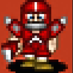
Let's look at one option, called "waifu2x" (yes, I know..). This is a state of the art algorithm that produces pretty good results. Again, the same process, 17% scale, 800% zoom to see what's going on:

Obviously, the tool didn't like transparency, but the image is certainly better than the previous variants. There is still blur though, and a pixel-art artist (pixel artist?) would probably make some different choices on the icon if it was made by hand. The mouth cover is much bulkier than it probably should be for instance. That being said, though, the result is remarkably good and much better than the previous variants. Unfortunately, though, this tool is a LUA application and runs the scaling process with GPU-acceleration, which is really not something that I can integrate into the client in any way. This method is really interesting from a technical perspective, and is assisted by AI technologies in order to figure out how to scale things. But still, we're looking at technology that is simply out of reach for our user base. It's simply not a viable option from a technology perspective, and even if it was, it would be a compromised situation for the most commonly used resolutions which is really what this whole project comes down to.
The thing is, if I am going to spend hundreds of hours of time on a client refresh at this scale, I want the end result to be as good as I can reasonably make it for the largest part of the user base. I want my time to be spent towards something I can be proud of and not something where I feel "it's good enough".
I tried another algorithm (which Wikipedia calls "Kopf–Lischinski") many years ago, and the results are simply not good enough. It goes wrong too often, and creates a mess in most situations. That algorithm looked very promising to begin with, which is why I went ahead and implemented it in Java during a summer vacation (in Iceland, so it must have been cool, right?).
So at this point in the process, I've concluded that rescaling the current set of icons using algorithms simply isn't something I'm prepared to spend my time on. My next blog will cover what the final approach is, and what that brings to the table in terms of possibilities.
See you then!
In this part, I want to push forward and talk about the problems of scaling icons and the benefits and drawbacks of various methods. I will also bring up the direction we are going right now and get into some possibilities I want to explore with this.
So let's begin at the current state and look at a typical icon, let's say a typical human lineman, scaled to 800%:
This blue-eyed youngling, eager to prove his worth on the pitch is a great icon, much like all the other ones we have on the site. However, there is a problem..
The current icon is the perfect size for a square of 30x30 pixels. When we introduce a scalable client (or more specifically a scalable field), the square size will go up, let's say to 35x35, which is roughly a 17% increase in size.
Look closer at the icon above, and you'll see that the head is 11 pixels wide. With a 17% increase, we need to somehow scale this to 13, adding 2 pixels in width for the head. And this is where we run into trouble. Where would you add those two pixels? Between the eyes? On the edges? What if we wanted to increase the scale a bit more and and had to make the helmet 16 pixels wide?
The core of the problem we're facing here is that the icons are inherently imperfect representations of a "reality", an artist has taken the concept of a human Blood Bowl player and the pixels in the icon represent the concept in a very limited amount of space. The eye of the player is two pixels wide, and conveys that they are blue. The overall context of where they are placed means we, as humans, interpret those two pixels as blue eyes. In order to scale the image up to an arbitrary size, we'd need to convert the pixel art into what it is originally supposed to represent, and then reduce that back to the size we want. This is a difficult process, especially considering that doing this miniature size icon means you have to super emphasize things like the eyes (which are way too big to be anatomically correct), much in the same way theatre makeup tends to super emphasize certain traits of the actors.
That being said, there are ways to rescale things using software. The simplest form is what's called "nearest neighbour" where you simply stretch the smaller icon into a larger canvas and pick the colour of the pixel that is closest. To visualize this a bit better, let's say we do the 17% increase of the human (and scale this up to 800% again for display purposes):
As you can see, the results are not great. The nose has become Neanderthal-wide, and the shoulder pads look very odd to say the least. Clearly, this isn't great and we could probably do better. Enter what's called "interpolation modes" or "resampling algorithms". Without going too much into this, let's look at what's called "Bicubic interpolation", where the software takes each part of a pixel and blends the colours to produce something that is closer to the original. Same process as before, a 17% rescale and we're looking at the icon at 800% scale:
Ok, that certainly looks better. However, we have lost a LOT of contrast. Any sharp lines are gone. The eyes have started to almost melt down his face and it looks like the whole thing is simply blurred, which is exactly what we have done. All pixels include information from neighbouring pixels which is exactly what a blur is. So can we do better? Sort of, maybe. This is, however, where things go a bit off a cliff in terms of complexity.
Let's look at one option, called "waifu2x" (yes, I know..). This is a state of the art algorithm that produces pretty good results. Again, the same process, 17% scale, 800% zoom to see what's going on:
Obviously, the tool didn't like transparency, but the image is certainly better than the previous variants. There is still blur though, and a pixel-art artist (pixel artist?) would probably make some different choices on the icon if it was made by hand. The mouth cover is much bulkier than it probably should be for instance. That being said, though, the result is remarkably good and much better than the previous variants. Unfortunately, though, this tool is a LUA application and runs the scaling process with GPU-acceleration, which is really not something that I can integrate into the client in any way. This method is really interesting from a technical perspective, and is assisted by AI technologies in order to figure out how to scale things. But still, we're looking at technology that is simply out of reach for our user base. It's simply not a viable option from a technology perspective, and even if it was, it would be a compromised situation for the most commonly used resolutions which is really what this whole project comes down to.
The thing is, if I am going to spend hundreds of hours of time on a client refresh at this scale, I want the end result to be as good as I can reasonably make it for the largest part of the user base. I want my time to be spent towards something I can be proud of and not something where I feel "it's good enough".
I tried another algorithm (which Wikipedia calls "Kopf–Lischinski") many years ago, and the results are simply not good enough. It goes wrong too often, and creates a mess in most situations. That algorithm looked very promising to begin with, which is why I went ahead and implemented it in Java during a summer vacation (in Iceland, so it must have been cool, right?).
So at this point in the process, I've concluded that rescaling the current set of icons using algorithms simply isn't something I'm prepared to spend my time on. My next blog will cover what the final approach is, and what that brings to the table in terms of possibilities.
See you then!
Comments
Posted by badger89 on 2019-04-07 19:53:51
Thanks for the update
Posted by Balle2000 on 2019-04-07 20:31:33
Thanks for this blog series. My personal favorite is "nearest neighbor" re-sampling. You might find this surprising, but the nose size and shoulder pads doesn't bother me at all. Would actually love to see this implemented for the old icons, if possible. Its not perfect, but seems a reasonable solution for keeping alive all those pixels out there.
Posted by SzieberthAdam on 2019-04-07 21:49:08
Thanks for the post. One remark: I very like nearest neighbor, but only with integer rates (2x, 3x, ...). You get the same icon, nice and retro looking. Obviously in a scalable client those icons would probably not fill their field squares but they would be surely bigger than half of the squares. The vector icons are a great way but I would recommend to keep legacy icons too. I am sure many would miss them a lot.
Posted by neubau on 2019-04-07 22:10:16
very much agreed with balle and adam, especially for custom leagues a system like that would be very important.
Posted by awambawamb on 2019-04-07 22:30:21
how about a fixed magnification for every pixel, like twice? to keep the "retro" looks.
Posted by Christer on 2019-04-07 22:40:06
60 pixel squares will not fit your screen unless you're one of the 2.5% of people accessing the site with a display capable of higher than 1920x1080p resolution.
Posted by spelledaren on 2019-04-07 23:11:35
Thank you.
Posted by reroll_LGC on 2019-04-07 23:54:18
Just want to thank you Christer for taking the time to explain this - not something I ever even thought of, but makes perfect sense now you've laid it out.
(I like the current size!)
(I like the current size!)
Posted by SzieberthAdam on 2019-04-08 00:51:57
The current field is 780x450 in size so it would be 1560x900 when doubled which fits in 1080p (1920x1080). I know there are other relevant GUI components to be shown around the field and I am also aware that a new layout/GUI is huge work.
Posted by koadah on 2019-04-08 02:57:22
I had a little play using tmoila's method
https://fumbbl.com/index.php?name=PNphpBB2&file=viewtopic&p=733744#733744
The result is here:
http://fumbbldata.azurewebsites.net/scale/elf.html
I don't have a big enough monitor to really appreciate how horrible it might look, but I'm guessing that it might take quite a while to get all of Secret League done. So I could probably live with "fairly horrible". ;)
Posted by Badoek on 2019-04-11 20:51:32
Vectorizing isn't an option I assume?
Not sure what it would entail but probably redrawing all icons, right?
Not sure what it would entail but probably redrawing all icons, right?
